Senses Gradients
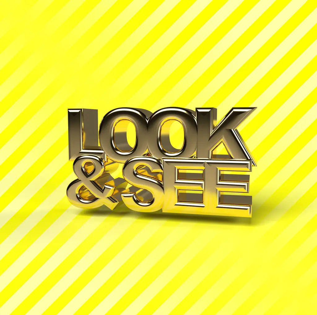
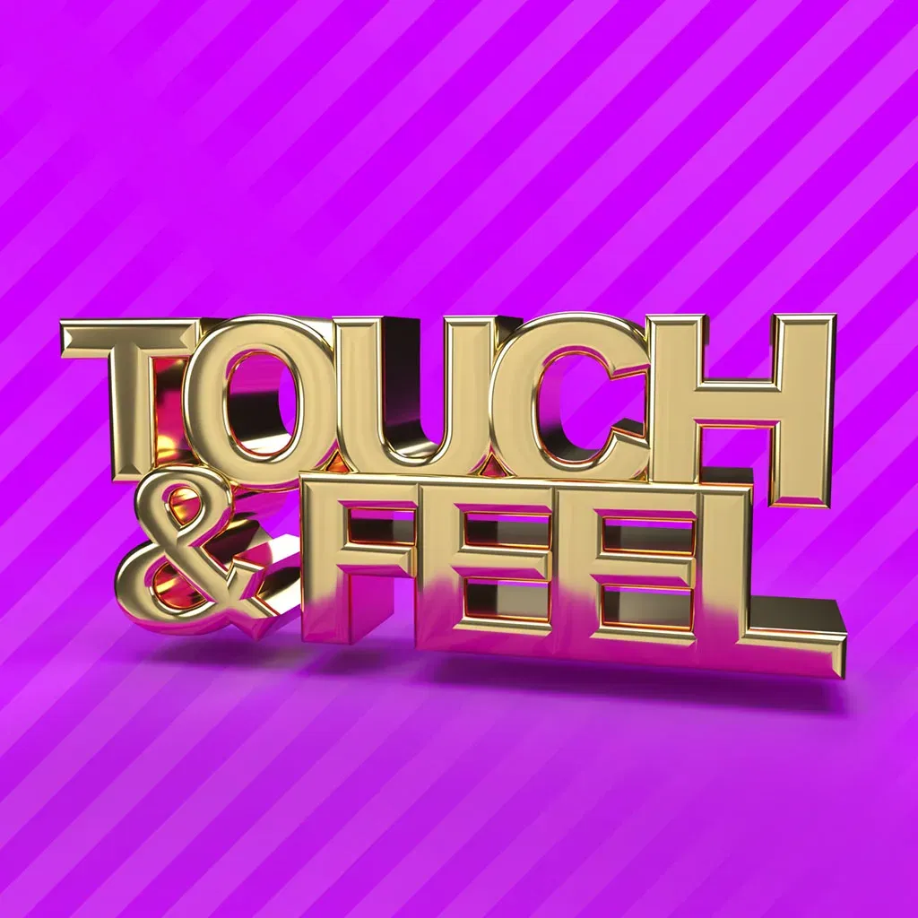
The Gradient series uses techniques from marketing to grab the attention of the viewer. The bold colours, the gradient, bold text are things we frequently see in advertising. The shiny gold text gives a fake sense of value, grabbing the attention even more. Once you read the text you come to a stop and start thinking. What am I looking at? What do I see? How do I feel? It’s these questions that I want the viewer to ask themselves. There are no wrong answers. It is about experiencing anew.
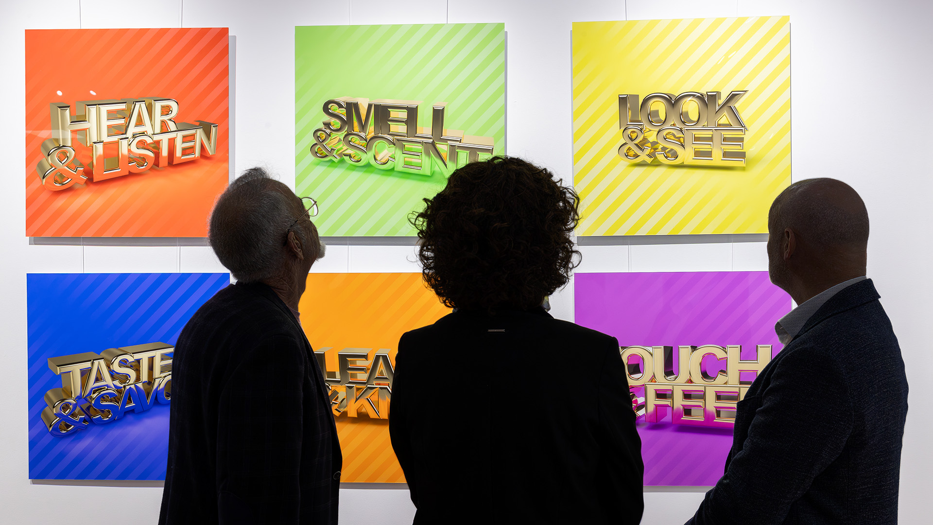
6 colours, 6 word pairs, 36 combinations.
The gradient series is a body of work of 36 images in total that use bold colours, attention grabbing gradient and gold rendered text to grab the attention of the viewer. It represents the struggle for attention we see across all media today. Once the viewer is focussed they see the text that invites them to pause, take distance and reflect.
As in previous series I have created these artworks in the primary and secondary colours creating 36 individual artworks that each have their own experience. Each pairing blends colour psychology and emotional resonance. Warm tones like orange and yellow evoke energy and joy. Cool hues like blue and green offer calm and reflection. The chosen combination becomes a personal reflection of what you feel and what you question. This makes each combination of colour and text a unique experience.
This is a series of 36 images in a limited edition of 10.
Artwork specifications
- Created 2023
- Certificate of Authenticity included
- High Quality photographic print
- Bonded behind 3mm Acrylic glass
- Bonded on 3mm DiBond aluminium
- Ready to hang.
- 60 x 60 x 2 cm
- Limited edition of 10 per image.
The combinations