A Journey into colour, emotion and reflection

6 colours, 6 word pairs, 36 combinations
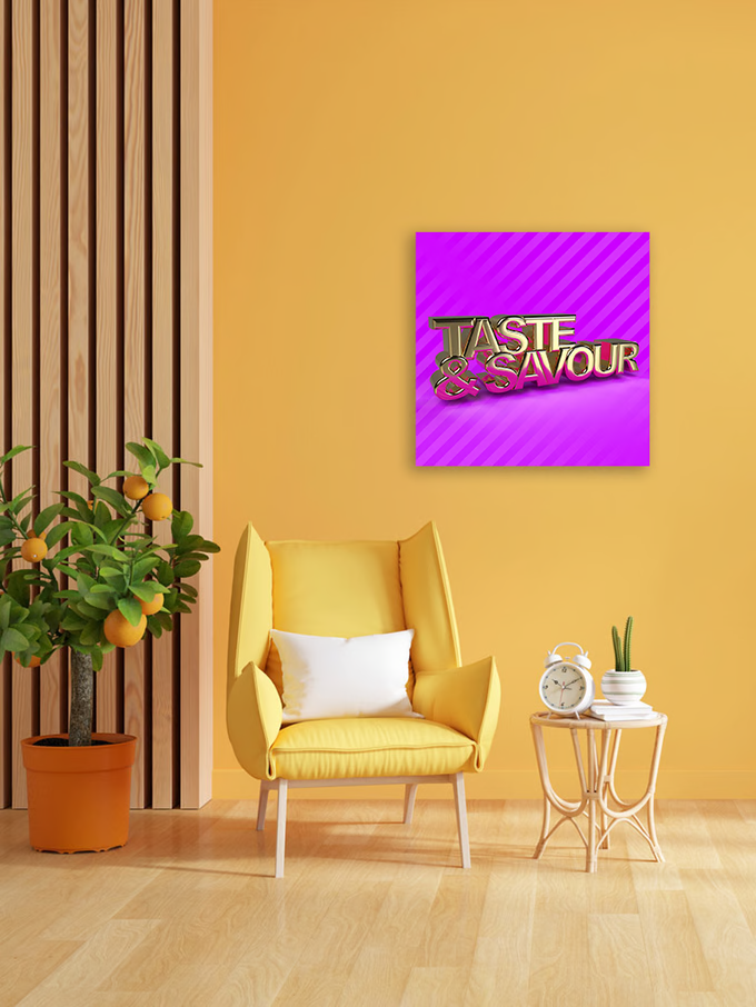
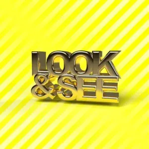
The gradient series is a body of work of 36 images in total that use bold colours, attention grabbing gradient and gold rendered text to grab the attention of the viewer. It represents the struggle for attention we see across all media today. Once the viewer is focussed they see the text that invites them to pause, take distance and reflect.
As in previous series I have created these artworks in the primary and secondary colours creating 36 individual artworks that each have their own experience. Each pairing blends colour psychology and emotional resonance. Warm tones like orange and yellow evoke energy and joy. Cool hues like blue and green offer calm and reflection. The chosen combination becomes a personal reflection of what you feel and what you question. This makes each combination of colour and text a unique experience.
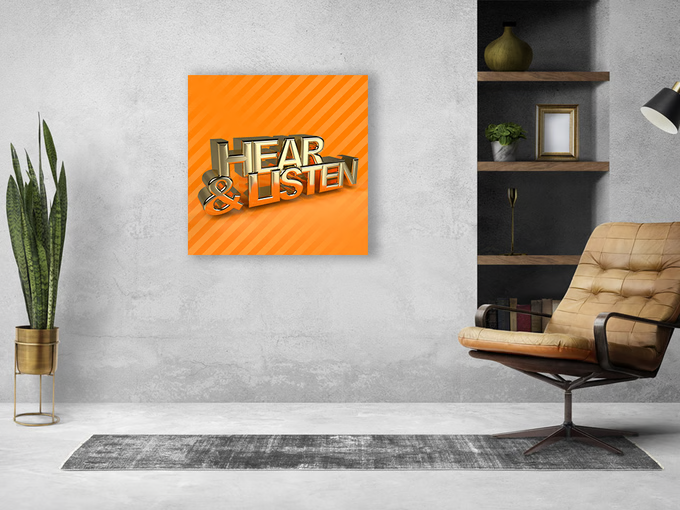
Mockup of Orange Gradient Hear&Listen
Senses Gradient Series


The Editions
- Museum-grade: Printed on archival photographic paper.
- Protected: Sealed under 3mm acrylic glass
- Built to last: Bonded to 3mm aluminium DiBond for gallery-level quality.
- Ready to hang: Comes with a secure hanging system.
- Signed & numbered: Only 36 master prints in each edition.
- Limited Editions: Only 10 Edition available.